6 The title page
Section 6.2 describes the title page as it is deployed today. The sections after it are the target, the page as it is meant to be, and section 6.9 lists every difference between the two as a numbered change. Only a change the owner has approved is built, one change at a time; anything no change names stays as it is deployed.
This chapter specifies a title's page: what it shows of a movie and of a show, and what people can do there. The frame around it is specified in chapter 2, and the player it starts in chapter 11.
6.1 Purpose
Section titled “6.1 Purpose”A title's page tells people what a title is and lets them act on it: play it, add it to a list, mark it as watched, like it, and on a phone download it. It opens from every card of a title: on home (chapter 4), in movies and shows (chapter 5), in the watchlist (chapter 8) and in search (chapter 9), from a notification about it (chapter 15), and from the similar titles at the foot of another title's page. Its people lead on to their own pages (chapter 7).
The page isn't one of the views, so the frame marks no view as current. Back returns to where the person came from.
6.2 As deployed
Section titled “6.2 As deployed”This section says what the four apps' title pages do as of 6 November 2026: the web as the public demo showed it that day, on the same build as production, and the apps as their code had them that day. The phone app, Android TV and the Samsung TV are described from their code until screenshots of them are taken. The Samsung TV app isn't released yet.
6.2.1 The web
Section titled “6.2.1 The web”The web's title page has no frame: no top bar, no side navigation and no tabs. Figures 6.1 to 6.6 are screenshots of it. Figure 6.1 shows the top of a movie's page on a computer, for a movie the viewer stopped part way.
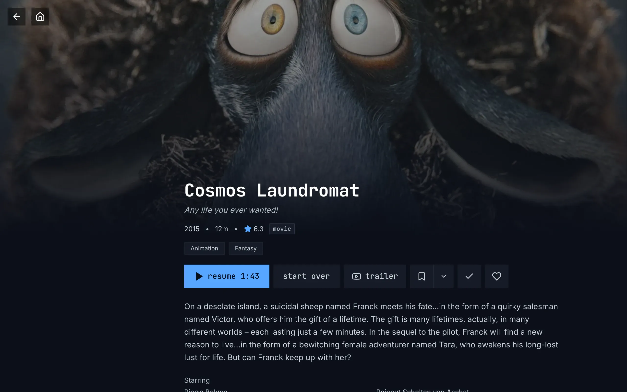
Figure 6.1: A movie's page on the web as deployed on 6 November 2026, on a computer, at 1280 × 800.
- Top left: back and home, two dark squares with an arrow and a house, standing on the picture.
- The still, across the width and dimmed, fading into the page's colour from its middle down. The name, the facts and the genres stand on its faded foot.
- The poster's place, left of the name, still empty: the poster fades in once it has loaded, and nothing stands in for it until then.
- The name, the tagline and the facts: “Cosmos Laundromat” in the monospace face, the tagline, “Any life you ever wanted!”, in italics, then “2015 • 12m • ★ 6.3” and the kind, “movie”, in a thin frame. The genres follow as chips, in the catalog's words: “Animation”, “Fantasy”.
- The row: “resume 1:43” in blue, then “start over”; “trailer” with a video site's logo, because this trailer opens online; add to list in two parts, a bookmark and ⌄; watched, a check; and liked, a heart.
- The description, whole, and under it “Starring”, at the window's foot.
Figure 6.2 shows the same page scrolled down to its people and the titles like it.
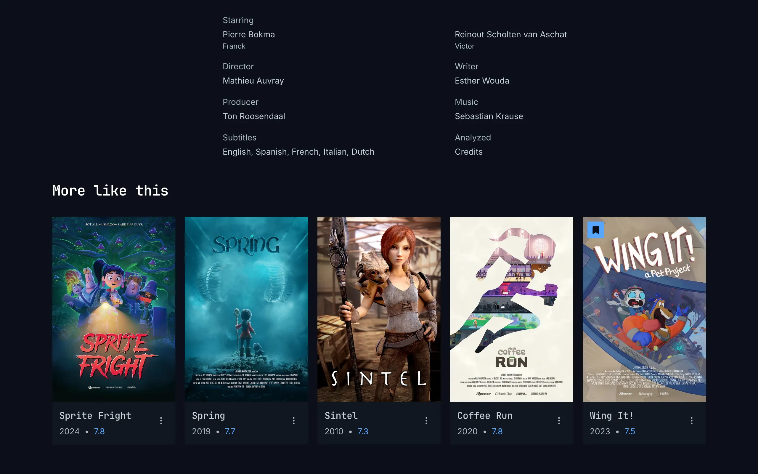
Figure 6.2: The foot of a movie's page on the web as deployed on 6 November 2026, on a computer, at 1280 × 800.
- Starring, a label in the body face, and the actors two to a line, each name over the part: “Pierre Bokma”, “Franck”.
- The crew, two to a line, each role under its label: “Director”, “Writer”, “Producer”, “Music”.
- Subtitles, the languages in the order of the title's tracks: “English, Spanish, French, Italian, Dutch”.
- Analyzed, the parts the server found in the title, here “Credits”.
- More like this, capitalised, and a row of posters. Under each poster stand the name in the monospace face, the year and the rating in blue, “2024 • 7.8”, and ⋮, which opens the card's menu; the bookmark on blue at the top left of “Wing It!” says it is in the Watchlist.
Figure 6.3 shows a movie's page on a phone held upright.
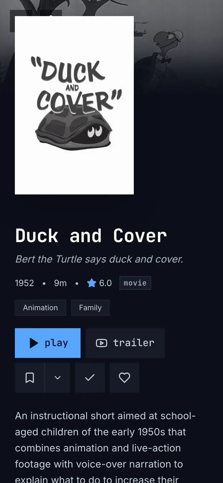
Figure 6.3: A movie's page on the web as deployed on 6 November 2026, on a phone held upright, at 360 × 780.
- Back and home, under the poster: only their top edges show. The poster covers them, so they can't be tapped.
- The poster, 192 px wide, above the name.
- The name, the tagline, the facts and the genres, as on a computer: “1952 • 9m • ★ 6.0”, “movie”, “Animation”, “Family”.
- The row wraps: play and trailer on the first line; add to list, watched and liked on the second.
- The description, under the row. There are no tabs at the foot.
Below 768 px wide the poster stands above the name, 192 px wide; from 768 px it stands beside it, 256 px wide, so a phone held sideways has the computer's layout, as figure 6.4 shows on a show's page.
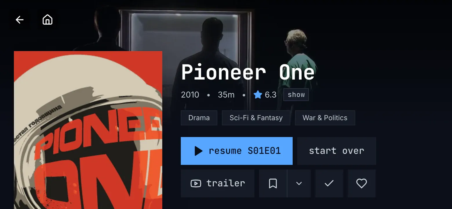
Figure 6.4: A show's page on the web as deployed on 6 November 2026, on a phone held sideways, at 780 × 360.
- Back and home, on the picture, clear of the poster.
- The poster, 256 px wide, beside the name.
- A show's facts: “2010 • 35m • ★ 6.3” and “show”; a show has a length, as the catalog gives it. The genres follow: “Drama”, “Sci-Fi & Fantasy”, “War & Politics”.
- The row: “resume S01E01” names the episode it plays, and “start over” plays that episode from its beginning; trailer, add to list, watched and liked wrap to a second line.
Figure 6.5 shows the same show's page scrolled to its episodes, on a computer.
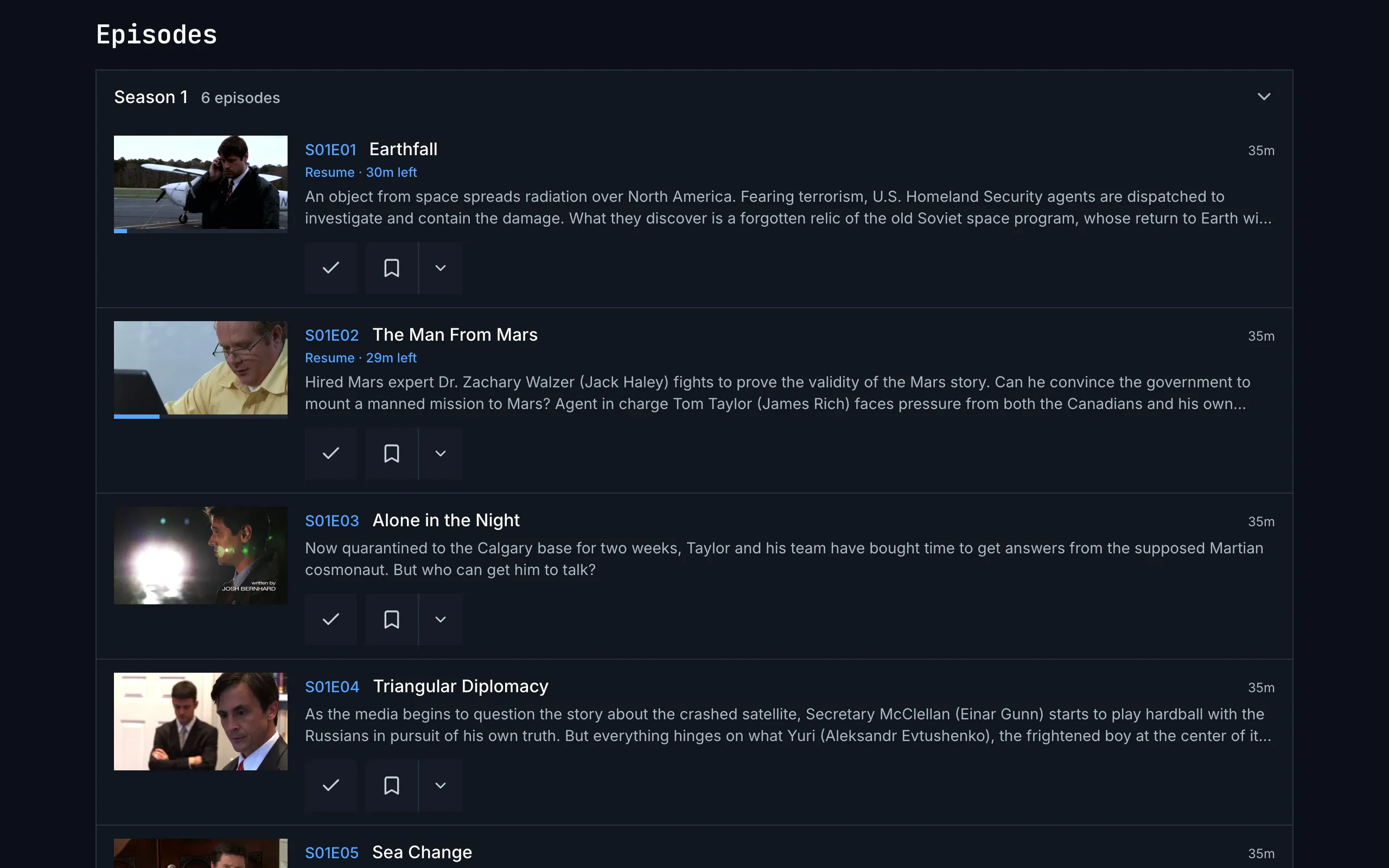
Figure 6.5: A show's episodes on the web as deployed on 6 November 2026, on a computer, at 1280 × 800.
- Episodes, capitalised, and the season's header: “Season 1” and “6 episodes”, with a chevron that closes the season. The first season starts open.
- An episode row: the still, 160 px wide, with a blue bar as far as the viewer got; the code in blue, “S01E01”, the name, “Earthfall”, and at the right the length, “35m”.
- The time left, “Resume · 30m left”, in blue, and the description, cut after two lines with “…”.
- The row's actions line: watched first, a check, then add to list, a bookmark and ⌄, 48 px high like the title row's controls. Anywhere else, a click on the row plays the episode.
Figure 6.6 shows the same episodes on a phone held upright.
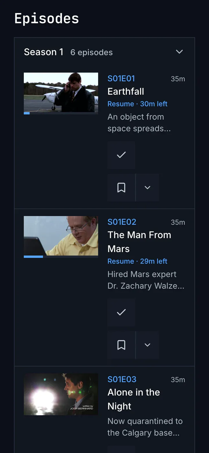
Figure 6.6: A show's episodes on the web as deployed on 6 November 2026, on a phone held upright, at 360 × 780.
- The season, as on a computer, across the page.
- The still, 128 px wide, beside the text: the code and the length on one line, the name under them on up to two lines.
- The time left and the description, the description cut after two lines.
- The actions line, in the narrow column beside the still: watched and add to list stand one under the other.
What the screenshots can't show, such as the page while it loads, the list picker, a page opened on an episode and a page that couldn't load, is in the table of section 6.2.5.
6.2.2 The phone app
Section titled “6.2.2 The phone app”The phone app's title page is a screen of its own, without the tabs. A bar that doesn't scroll holds back and home, 40 dp squares side by side, and on Android the cast button at the right while a device that can play is on the network. The bar isn't there while the page loads, when a spinner turns alone, nor when the page couldn't load; iOS has no system back, so there that screen's only way on is try again. Below 600 dp wide the poster, 192 dp, stands above the name; from 600 dp it stands beside it, and the name and the facts rise onto the still's faded foot. The facts are the web's, but the kind is in capitals, “MOVIE” or “SERIES”, the rating is cut to one decimal rather than rounded, and there is no age rating.
The row has the web's controls, sizes and words, and on Android download comes last: “download · 1.4 GB”. A show's row has none: each open season offers “download 2 more episodes · 724 MB”, every episode has its own, and “3 of 8 downloaded” stands under the row once some are on the phone; iOS has no downloads yet. Under the description come the web's labels; the subtitles keep the server's order, name their kind, “English · for deaf and hard of hearing”, and are cut after two lines. More like this shows no status marks. The seasons come in the server's order, which puts season 0 first, as “Season 0”, and all of them start closed, except the season of an episode the page was opened on; a season of one says “1 episode”. An episode's actions line is add to list, watched, then its download. Without a connection, a downloaded title's page is built from what is on the phone, under “Can't reach the server. Your downloads still play.”
6.2.3 Android TV
Section titled “6.2.3 Android TV”The Android TV title page has no rail and nothing at its top; the remote's back leaves it. While it loads, “Loading…” stands in the middle. The still fades out before the poster's row, so no words stand on it, and the poster, 200 dp, stands beside the name. The row's words are lowercase, as on the web, at 33 dp high and about 22 dp apart; the list picker opens over the page with “New list…” as its first row, and a trailer online shows a video site's logo. The facts are the web's, with the rating in the TV's language, “7,4” on a German TV, the kind “movie” or “series”, and no age rating. The description stops after four lines.
“starring” is a row of cards with the initials, never a photo, one for every actor. The crew's labels are lowercase, “director”, “writers”; “subtitles” lists the languages alphabetically and cuts them after three lines, “+12 more”; there is no Analyzed. The seasons come in the server's order, so season 0 first, as “Season 0”, and the first listed is the one that opens; one episode is “1 episodes”. A watched episode's name isn't dimmed, a length past an hour reads “75m”, and the actions are watched, then add to list. A page opened on an episode opens its season, puts the focus on its row, tinted with a blue bar at its left, and names that episode in the first button. The code gives the page no first focus; back from a person's or another title's page puts the focus on the card that opened it. A page that couldn't load offers try again and no back, and no access says “you don't have access to this title”.
6.2.4 Samsung TV
Section titled “6.2.4 Samsung TV”The Samsung TV title page has no rail and nothing at its top either. While it loads, a spinner turns with “Loading…”. The top half of the page stands on the still, and the poster, 308 × 462 px, beside the name. The kind is in capitals, “MOVIE”, “SERIES” or “EPISODE”, and there is no age rating. The row's words are capitalised: “Play”, “Resume 1:43”, “Start over”, “Trailer”, and on a show “Play S01E01” or “Resume S01E03”. Add to list is one button, a “+” that turns into a check on green and puts the title in the default list, with no list picker; there is no liked, and watched is an eye. A focused plain button turns white, and the focus ring is the accent's blue rather than the focus colour. The focus starts on play.
The description is whole, or “No description available.”; “Starring” is a row of cards with the initials, the crew stand in three columns, the subtitles keep the tracks' order and aren't cut, and “Analyzed” follows them. More like this shows no watched marks. The seasons come in order with season 0 last, as “Specials”, and only the first starts open; one episode is “1 episodes”. An episode row has no bar and no time left, and only its watched toggle, an eye named “Mark episode as watched”; a file of several episodes is a row per episode. An episode opened from continue watching or a notification gets a page of its own, without seasons. Back from another page or from the player loads the page again, with the focus on play. A page that couldn't load says one line in red, such as “Could not load this title: chino-api 503.”, with no button; a removed title and one the viewer may not see end the same way, with “chino-api 404” and “chino-api 403”.
6.2.5 Feature by feature
Section titled “6.2.5 Feature by feature”The table compares the four title pages feature by feature. “—” is a feature the app doesn't have, and “not found” one its code was searched for and doesn't have.
| Feature | Web | Phone app | Android TV | Samsung TV |
|---|---|---|---|---|
| The frame | none: back and home float over the still, 36 px squares on a see-through black; on a phone held upright the poster covers them | a bar of its own with back and home side by side, and cast on Android; no tabs; no bar while loading or when it couldn't load | none: no rail, no back, no home | none: no rail, no back, no home |
| While it loads | a spinner alone | a spinner alone | “Loading…” in the middle | a spinner and “Loading…” |
| The still | 21:9, at most 60% of the window's height, dimmed; the name, the facts and the genres stand on its faded foot | at most 60% of the page's height; from 600 dp wide the name and the facts stand on it | 560 dp tall, faded before the poster's row | 60% of the screen's height, dimmed; the top half of the page stands on it |
| The poster | below 768 px wide 192 px, above the name; from 768 px 256 px, beside it; its place empty until it has loaded | 192 dp; below 600 dp above the name, from 600 dp beside it | 200 dp, beside the name | 308 × 462 px, beside the name |
| The length | “12m”, “1h 32m”; a show has one where the catalog gives it, “35m” | the same | the same | the same |
| The rating | “★ 6.3”, rounded | cut to one decimal, not rounded | one decimal in the TV's language, “7,4” on a German TV | “★ 6.3” |
| The age rating | a badge in the board's words: “FSK 12”, “PG-13”, “16+” | not found | not found | not found |
| The kind | “movie”, “show” | “MOVIE”, “SERIES” | “movie”, “series” | “MOVIE”, “SERIES”, “EPISODE” |
| The genres | chips under the facts, in the catalog's words: “Sci-Fi & Fantasy” | chips | chips | chips |
| play, resume | “play”; past 30 s, “resume 1:43” and “start over” | the same | the same | “Play”, “Resume 1:43”, “Start over” |
| A show's first button | “resume S01E01” or “play S01E02”: the show's first row in continue watching, else S01E01 | the same | the same; without a row, the server's next episode | “Play S01E01”, “Resume S01E03” |
| trailer | “trailer”: one of the server's plays in the player, with a clapperboard; one online opens in a new tab, with a video site's logo | a clapperboard either way | a clapperboard, or the video site's logo for one online | “Trailer”, a clapperboard or the video site's logo |
| Add to list | two parts: the bookmark for the Watchlist, ⌄ for the list picker, under the control | the same; the picker from the bottom | the same; the picker over the page | one button, a “+” that turns into a check on green; it uses the default list; no picker |
| A new list from the picker | “new list…” opens a name field in the picker | “New list…”, a field and a check | “New list…”, the first row, then a field | — |
| Watched, liked | a check, dark on green; a heart, dark on red | the same | the same | an eye, a check on green; no liked |
| The row's controls | 48 px high, 8 px apart, square, wrapping between controls | 48 dp, 8 dp apart | 33 dp high, about 22 dp apart; the ring in the focus colour | about 36 dp high, the toggles 33 dp; a focused plain button white, the ring in the accent's blue |
| download | — | Android: last in a movie's row, “download · 1.4 GB”; a season's “download 2 more episodes · 724 MB”; “3 of 8 downloaded” under a show's row. iOS: none | — | — |
| The description | whole; without one, “No description available.” | whole; nothing without one | four lines at most; nothing without one | whole; without one, “No description available.” |
| Starring | a label, two names to a line, each over the part; “Full cast (12)” and “Show less” for more than 8 | the same; three to a line where the text column is 600 dp wide | “starring”, a row of cards with the initials, never a photo; every actor | “Starring”, a row of cards with the initials; every actor |
| The crew | “Director”, “Writers”, “Music”, two to a line | the same | lowercase: “director”, “writers” | capitalised, in three columns |
| Subtitles | “Subtitles”: the languages in the tracks' order | the tracks' order, with their kind; cut after two lines | “subtitles”: alphabetical; “+12 more” after three lines | the tracks' order, whole |
| Analyzed | “Intro · Credits · Recap”, the parts found | the same | not found | the same |
| More like this | “More like this”, up to 12 posters with their marks and menus, a row that scrolls | “More like this”, up to 12, no marks | “more like this”, up to 12, with their marks | “More like this”, up to 12, no watched mark |
| The seasons | “Episodes”; season 0 hidden while there are numbered seasons; the first open; “Season 1”, “6 episodes”, “1 episodes” | “Episodes”; the server's order, season 0 first as “Season 0”; all closed; “1 episode” | “episodes”; season 0 first as “Season 0”; the first open; “1 episodes” | “Episodes”; season 0 last, “Specials”; the first open; “1 episodes” |
| An episode row | the bar; “S01E01” in blue, the name, “35m”; “Resume · 30m left”; two lines of description; a watched name dimmed | the same | the same; past an hour “75m”; a watched name not dimmed | no bar, no time left; a watched name not dimmed |
| Its actions | watched, then add to list; on a phone stacked beside the still | add to list, watched, then the download | watched, then add to list, at the row's end | watched alone, an eye |
| A file of several episodes | one entry: “S03E18–21”, “4 episodes · one file” | the same | the same | a row per episode |
| Opened on an episode | the show's page, the season open, the row scrolled to and outlined in blue; the first button names the show's own episode | the same; the row tinted and outlined in blue | the same; the row tinted with a blue bar at its left and focused; the first button names that episode | the episode's own page, without seasons |
| The focus | — | — | the code sets none at first; back from a page puts it on the card that opened it | on play at first; back loads the page again, the focus on play |
| Back from the player | the browser's back: the page as the browser kept it, brought up to date, or loaded again | brought up to date after half a second, without a spinner | brought up to date | loaded again |
| Couldn't load | “couldn't load this title”, the reason, try again with a quiet back beside it, details | the same, without back: the screen has no bar | the same, without back | one red line, “Could not load this title: chino-api 503.”; no button |
| Not there, no access | “this title isn't in the library anymore”, “you don't have access to this”, each with back | the same | the same, but “you don't have access to this title” | the red line with “chino-api 404”, “chino-api 403” |
| The episodes couldn't load | “couldn't load the episodes”, the reason, a quiet try again | nothing: the episodes are left out | nothing | nothing |
| Without a connection | — | a downloaded title's page from the phone, under “Can't reach the server. Your downloads still play.”; any other title couldn't load | — | — |
6.3 A movie's page
Section titled “6.3 A movie's page”6.3.1 On a computer
Section titled “6.3.1 On a computer”Figure 6.7 shows a movie's page on a computer, for a movie the person hasn't started. The page scrolls as a whole; the figure shows its top.
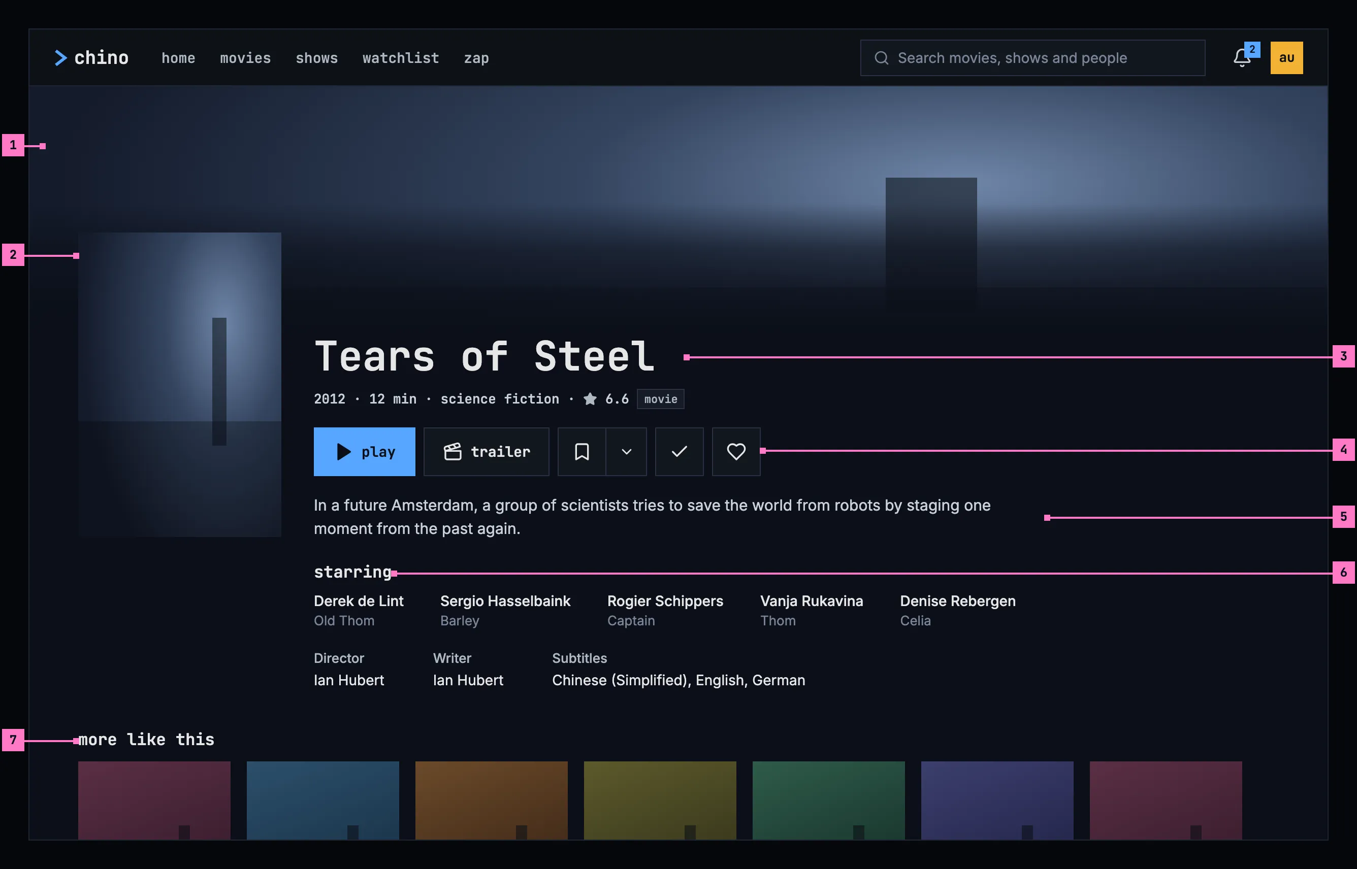
Figure 6.7: A movie's page on a computer, at 1280 × 800.
- The still. A picture from the title fills the width under the top bar and fades into the page's colour before the first words, so nothing is ever written on the picture.
- The poster, beside the name, reaching up into the still.
- The name and its facts: the year, the length, the genres, the rating and the kind, movie or show. A tagline, where the catalog has one, goes under the name. Section 6.8.1 lists the facts.
- The title row: play, trailer, add to list, watched and liked, specified in section 6.5. trailer is there only when the title has a trailer.
- The description. A title without one goes straight on to the people; no sentence says that it's missing.
- The people: starring, the actors with the parts they play, then the crew by role and the languages of the subtitles. A name opens that person's page. Section 6.8.2 has the rules.
- more like this: titles that share genres and people with this one, as posters (section 6.8.3). Choosing one opens its page.
6.3.2 On a phone held upright
Section titled “6.3.2 On a phone held upright”Figure 6.8 shows the same page on a phone held upright. The parts are those of figure 6.7; the numbers mark where the phone differs.
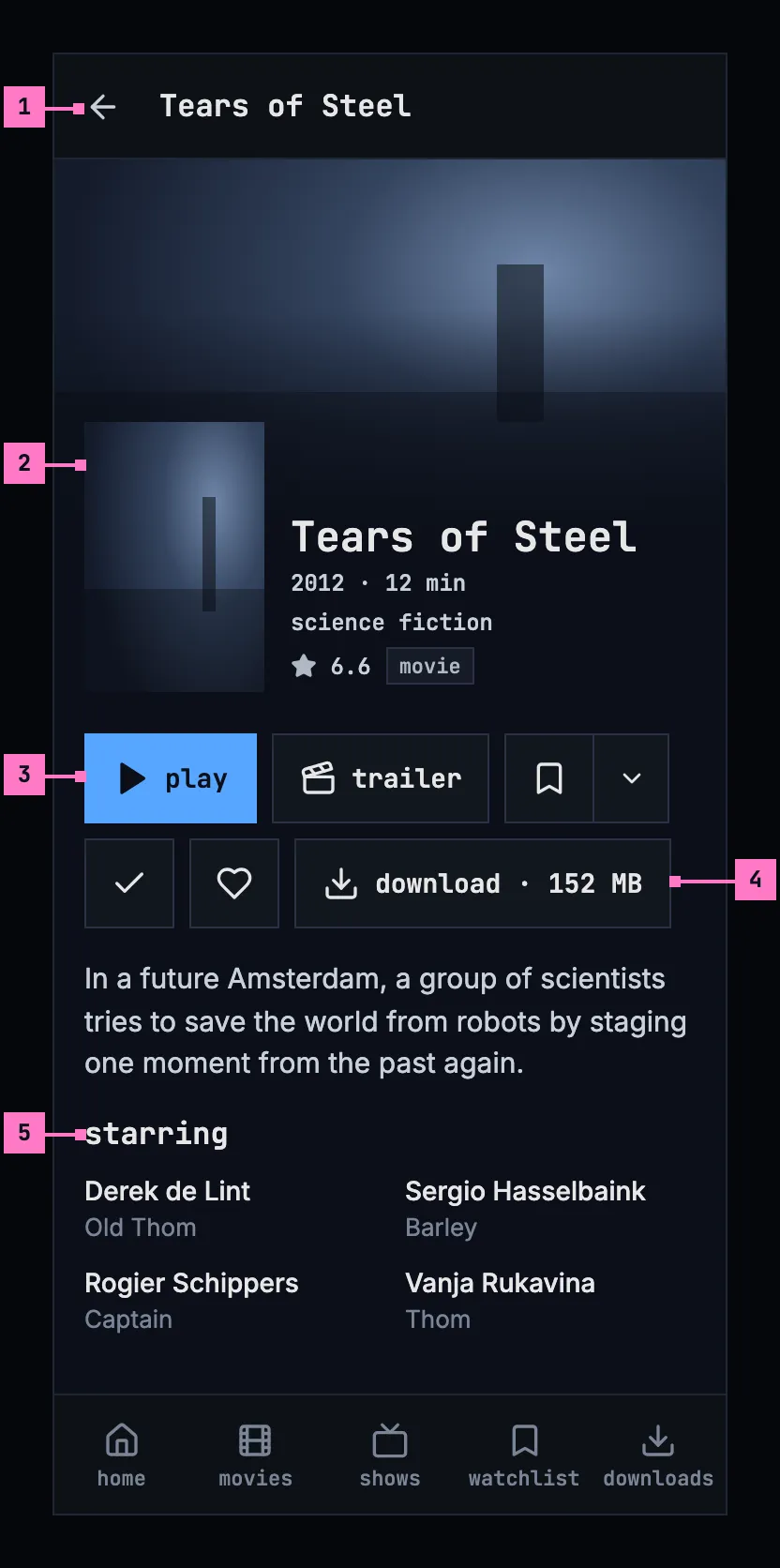
Figure 6.8: A movie's page on a phone held upright, at 360 × 780 dp.
- The bar shows a back arrow and the title's name in place of the top bar, as every screen opened from a view does (chapter 2), and the tabs stay. While a TV to cast to is on the network, the cast button joins the bar on the right (chapter 14).
- The poster is smaller and stands beside the name, so the title row is in view without scrolling. The facts wrap onto three lines here, in their order, and a fact is never split between two.
- The title row wraps where the phone is too narrow for it, a control as a whole.
- download comes last in the row, with the size the download will take: “download · 152 MB”. Once it starts, the control shows how the download stands (chapter 13).
- The people stand two to a line.
A screen less than 600 dp wide, as a phone held upright is, has this layout. The web on a phone has the layout of figure 6.8 with its own tabs (chapter 2) and without download.
6.3.3 On a phone held sideways
Section titled “6.3.3 On a phone held sideways”Figure 6.9 shows the page on a phone held sideways: from 600 dp wide, the page has the computer's layout at the phone's size. The numbers mark where it differs from figure 6.8.
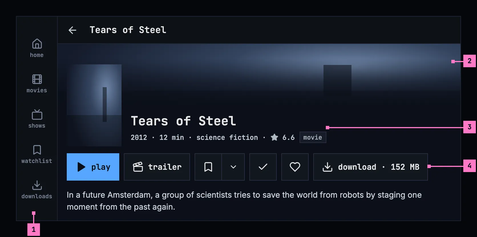
Figure 6.9: A movie's page on a phone held sideways, at 780 × 360 dp.
- The tabs become a rail down the left edge, and the bar is slimmer, with the same back arrow and name (chapter 2).
- The still is a band across the top, faded into the page's colour before the name, as on a computer.
- The name and the facts stand beside the poster, which keeps its size, and the facts fit on one line.
- The title row runs on one line under the poster, download last.
The description follows the row, and the people stand three to a line. The web on a phone held sideways has the same layout, with its own tabs as the rail (chapter 2) and without download.
6.3.4 Turning the phone
Section titled “6.3.4 Turning the phone”The page turns with the phone, and turning it changes only the layout, as figures 6.8 and 6.9 show. The page stays at the part the person was looking at, a season that is open stays open, an open list picker or card menu stays open, and a download goes on.
- Turned sideways, the tabs become the rail and the bar gets slimmer. The still becomes a band, the facts and the row get one line each, and the people stand three to a line. A show's episodes take the computer's layout (section 6.4.3).
- Turned back upright, the tabs come back at the foot, the facts and the row wrap again, and the people stand two to a line.
6.3.5 On a TV
Section titled “6.3.5 On a TV”Figure 6.10 shows the page on a TV, as it opens. The rail stays on the left with no view current, and the page keeps to the safe area.
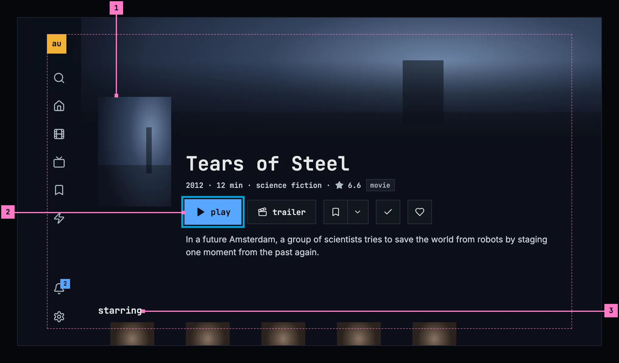
Figure 6.10: A movie's page on a TV, at 960 × 540 dp.
- The poster and the name sit low enough for the still to show above them. The words stand on the page's colour, as on a computer.
- The focus starts on play, or on resume for a title stopped part way. The row's controls are 40 dp high and 12 dp apart, so a focused control can grow and show its ring without touching the next. Left and right move along the row; down moves to the people, then to a show's episodes and to more like this; up from there brings the top of the page back.
- starring is a row of cards, one per actor: the photo, or the initials where the catalog has no photo, then the name and the part. The row runs on past the safe area to the screen's edge, as home's rows do. The crew follows, a line per role, and every name takes the focus.
The description shows four lines at most and ends in “…” where it's cut. The subtitle languages take three lines at most and count the rest: “Arabic, Chinese, English, +12 more”. Back from a person's page or from another title's page puts the focus on the card or the name that opened it, with the page scrolled as it was.
6.4 A show's page
Section titled “6.4 A show's page”A show's page has the parts of a movie's page, and under the people, its episodes, season by season. Its first button plays an episode and names it (section 6.6), and its row has no download: episodes download from their rows and their season. Figures 6.11 to 6.14 show the page scrolled down to the episodes, for a show the person is in the middle of: the first two episodes finished, the third stopped part way.
6.4.1 On a computer
Section titled “6.4.1 On a computer”Figure 6.11 shows the episodes on a computer.
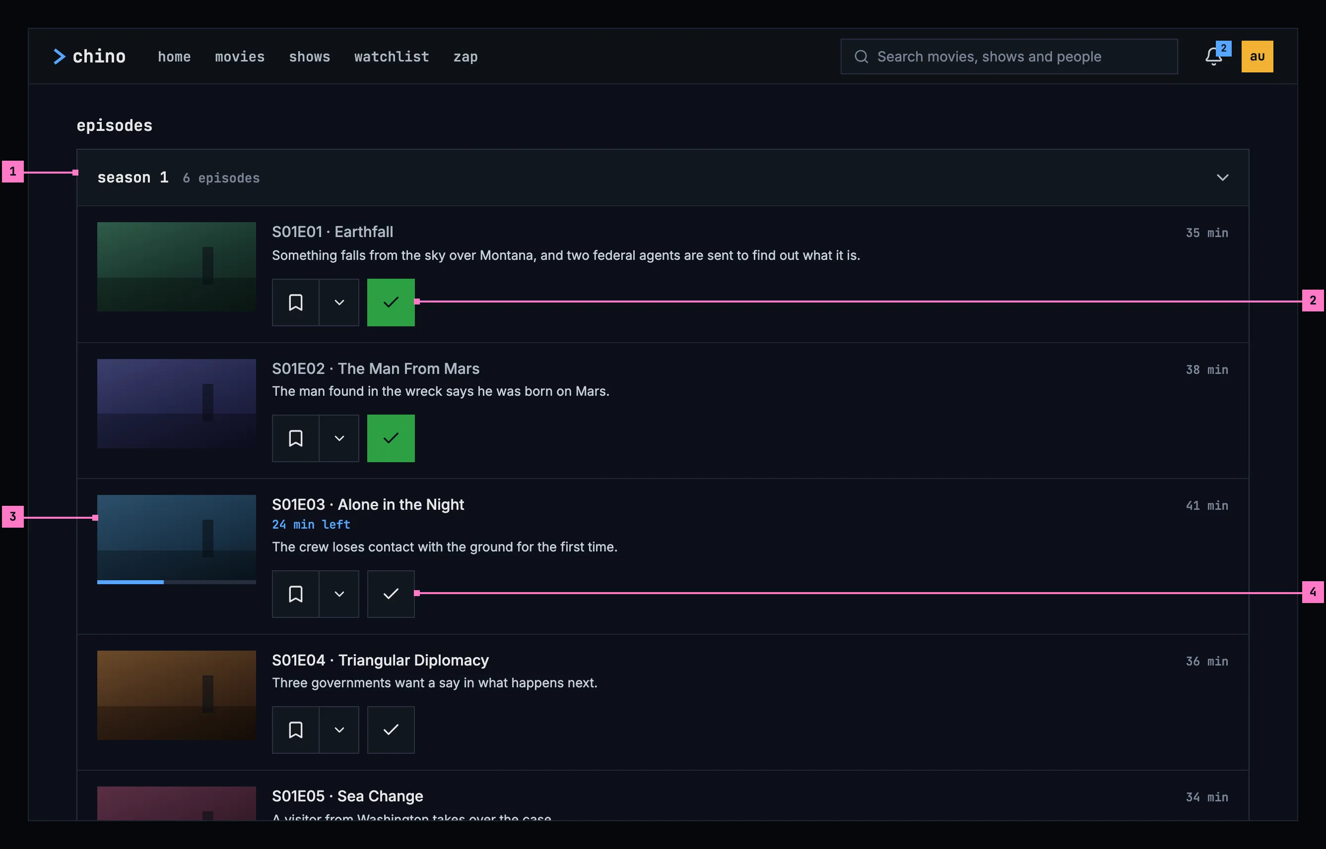
Figure 6.11: A show's page on a computer, scrolled to its episodes, at 1280 × 800.
- The season, under episodes: its name and how many episodes it holds. The header opens and closes the season; section 6.7.1 says which seasons start open.
- A finished episode. Its name is dimmed, and its watched toggle is on, the check dark on green.
- The episode the person is in. The bar on its still shows how far they got, and “24 min left” under the name says how much is left.
- The episode's actions: add to list and watched, in the title row's order and at its height, under the description. Nothing is drawn on the still (section 6.5.4). The rest of the row plays the episode, from where the person stopped.
6.4.2 On a phone held upright
Section titled “6.4.2 On a phone held upright”Figure 6.12 shows the same part of the page on a phone held upright. It differs from figure 6.11 in what a phone keeps to watch offline.
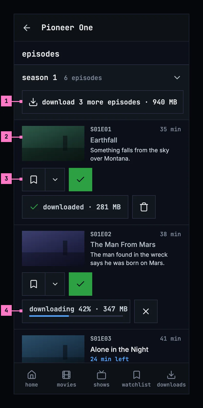
Figure 6.12: A show's page on a phone held upright, scrolled to its episodes, at 360 × 780 dp.
- The season's download, under its header, takes the season's episodes that aren't on the phone or on their way yet, all at once: here “download 3 more episodes · 940 MB”, in the words of chapter 13.
- The episode row. The still, then the episode's code and length on one line, and its name with the column to itself, on up to two lines, so it's never cut to a word.
- The actions line runs under the still and the text: add to list, watched, and the episode's own download, wrapping between controls, never inside one.
- A download on its way shows how far it is, with a button to cancel it; a downloaded episode shows its size, with a button to delete it.
Under the title row, a show that is partly on the phone says how far: “1 of 6 downloaded” (chapter 13).
6.4.3 On a phone held sideways
Section titled “6.4.3 On a phone held sideways”Figure 6.13 shows the episodes on a phone held sideways. The rows take the computer's layout of figure 6.11, and the season's download stays.
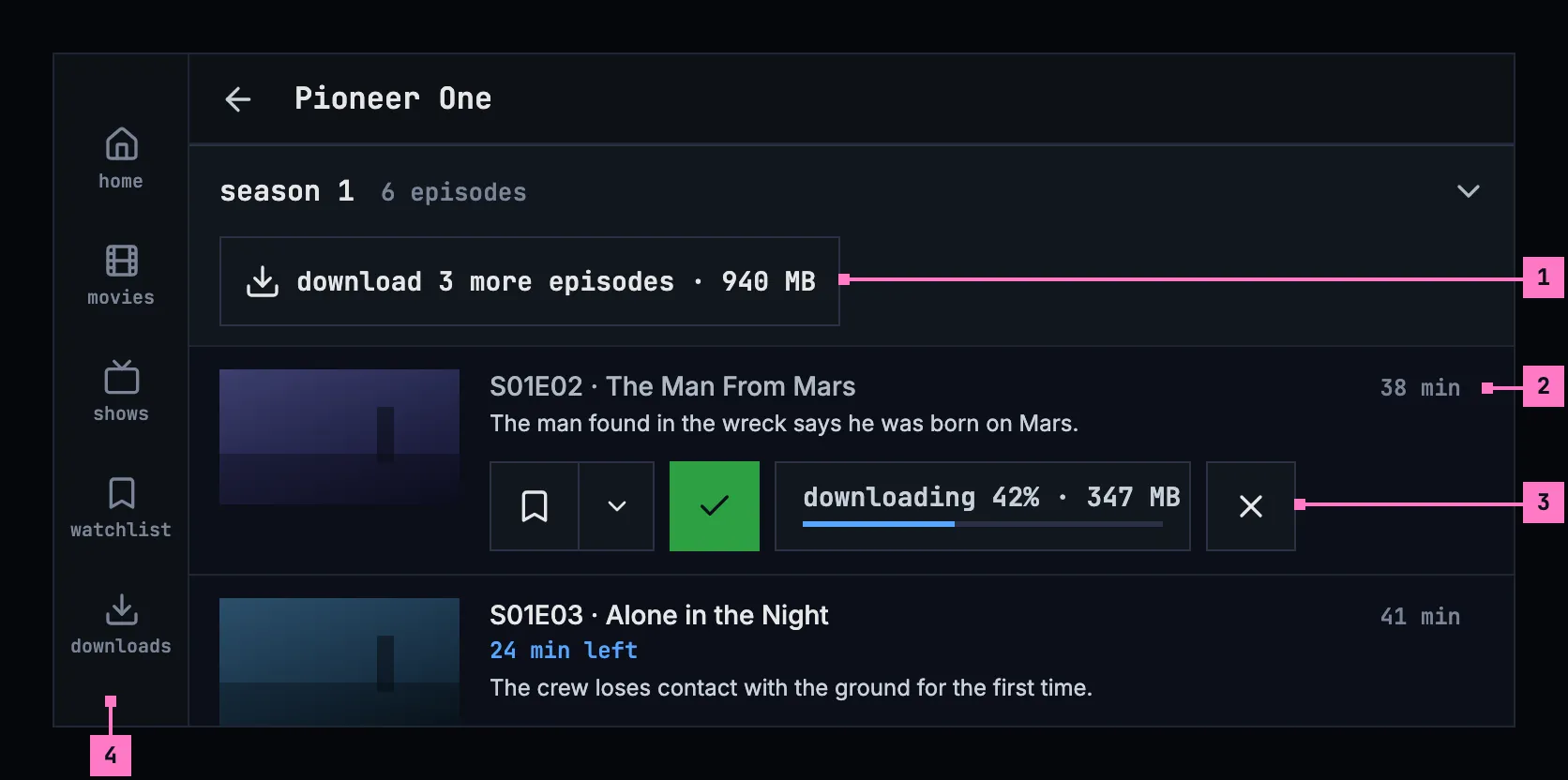
Figure 6.13: A show's page on a phone held sideways, scrolled to its episodes, at 780 × 360 dp.
- The season's download, under its header, as upright.
- The episode row: the still, then the code and the name on one line with the length at its end, and the description under them.
- The actions line runs under the text, beside the still, as on a computer: add to list, watched and the episode's own download.
- The rail, as on a movie's page (figure 6.9).
Turning the phone works as section 6.3.4 sets out.
6.4.4 On a TV
Section titled “6.4.4 On a TV”Figure 6.14 shows the episodes on a TV, with the focus on the episode the person is in.
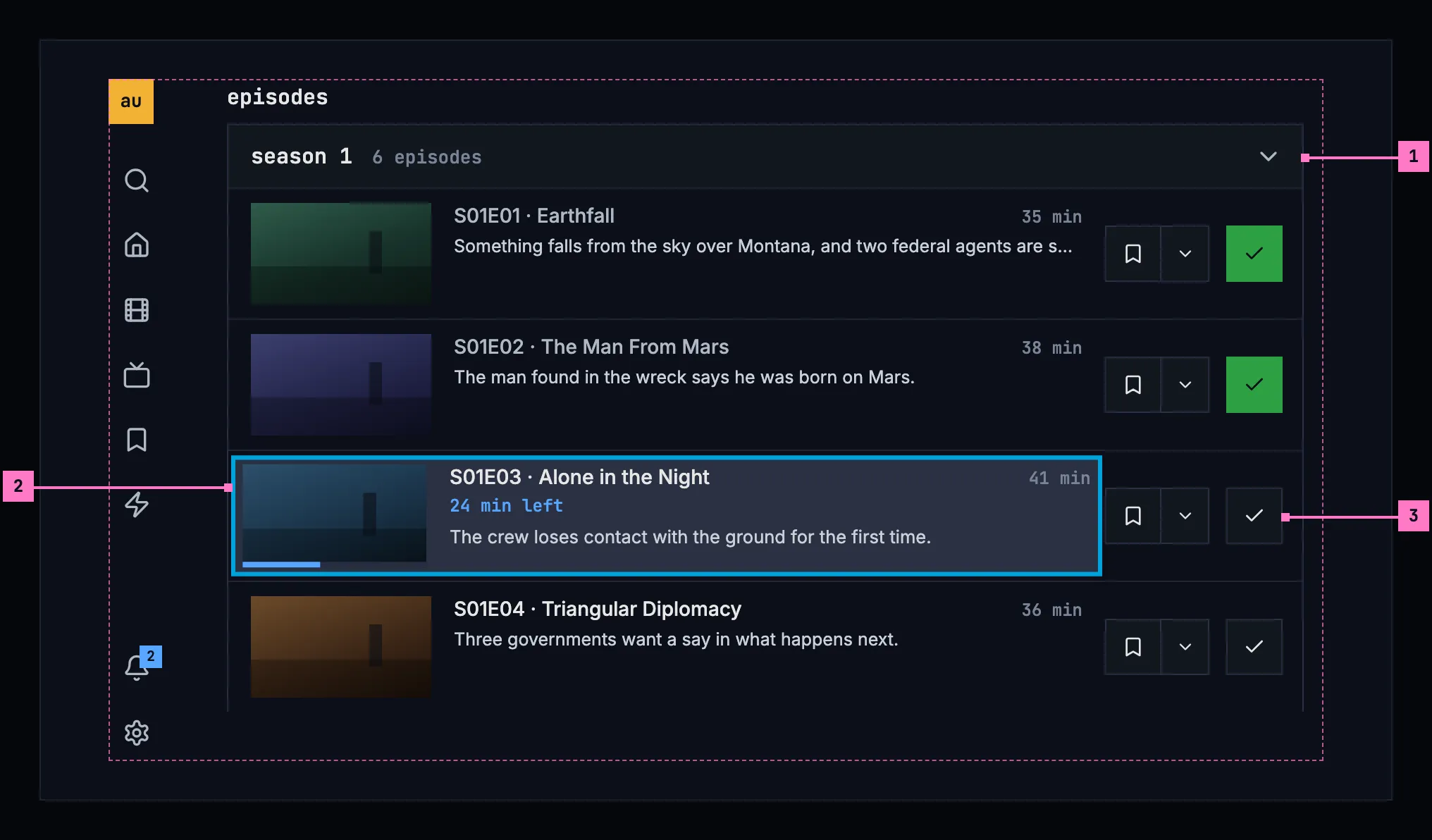
Figure 6.14: A show's page on a TV, the focus on an episode, at 960 × 540 dp.
- The season's header is a row the focus can take; OK opens and closes the season.
- The focused episode. The episode is one focus stop, a row with the ring inside its edge, 2 % larger. OK plays it, from where the person stopped.
- The actions sit at the row's end, each a focus stop of its own: right from the row reaches add to list, then watched.
6.5 The actions
Section titled “6.5 The actions”A title's page offers what people can do with it: play it, add it to a list, mark it as watched, like it, download it. These actions look and behave the same on every screen and in every app, so people never wonder whether a smaller button does something else.
6.5.1 The row
Section titled “6.5.1 The row”On a title's page, in this order:
play, or resume 1:43 and start over · trailer · add to list · watched · liked · download
Figure 6.15 shows the row on a movie in three states.
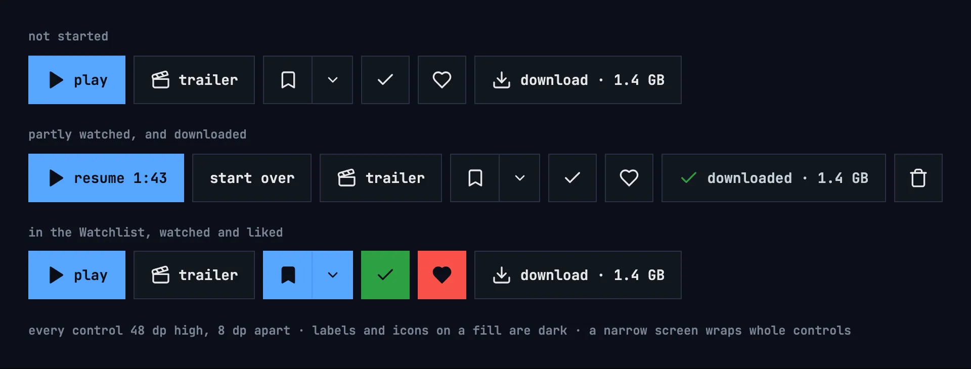
Figure 6.15: The row on a movie: not started; partly watched and downloaded; in the Watchlist, watched and liked.
- Every control in the row has one height: 48 dp on a computer, a phone or a tablet. Icon buttons are 48 × 48 dp, with 8 dp between controls.
- The TV keeps its own control height, 40 dp, and its focus style, with the same controls in the same order and 12 dp between them.
- When the row wraps, a control wraps as a whole.
- resume 1:43 says where the title picks up, and start over plays it from its beginning. A title stopped within its last minutes is finished and shows play again (chapter 11).
- trailer plays the trailer this server has, in the app's player; a title whose trailer is only online opens it outside the app. Its icon is the clapperboard either way.
- download is in the phone app only, and not when the server has turned downloads off (chapter 13).
6.5.2 Add to list
Section titled “6.5.2 Add to list”One control in two parts, in one frame and at one height:
- The main part shows and toggles the Watchlist: an outlined bookmark when the title isn't in it, a filled one when it is. It never touches other lists.
- “⌄” opens the list picker, with a check against each list that holds the title. That's where a title leaves other lists; its last row, create list, opens the dialog that starts a new list with the title in it (chapter 8).
- The two parts touch, with a 1 dp divider and the same fill. The “⌄” part is drawn 40 dp wide at the full height; its touch target is 48 × 48 dp. On a TV they are two focus stops, each with its own ring, drawn inside the part as on a row, so the other part stays whole and the divider stays visible.
Figure 6.16 shows the control off and on, and the picker it opens.
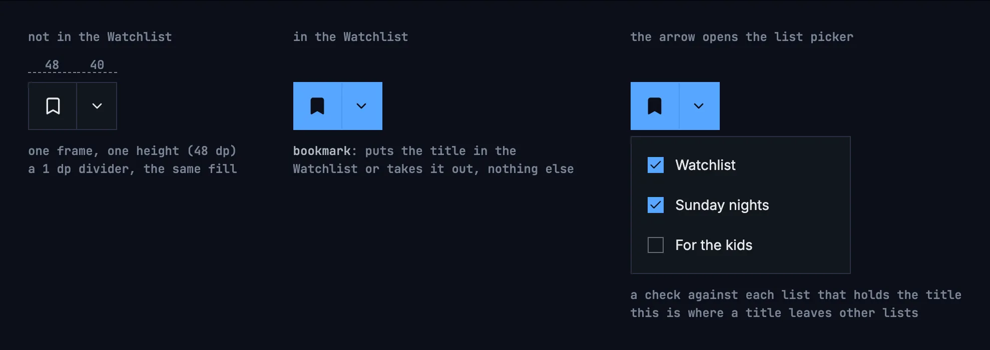
Figure 6.16: The add-to-list control off and on, and the list picker the arrow opens.
The picker opens under the control on a computer, from the bottom of the screen on a phone, and over the page on a TV, where back closes it.
6.5.3 On and off
Section titled “6.5.3 On and off”Labels and icons on a filled colour are dark.
| Control | Off | On |
|---|---|---|
| Add to list | an outlined bookmark on the plain surface | a dark bookmark on blue: in the Watchlist |
| Watched | an outlined check on the plain surface | a dark check on green |
| Liked | an outlined heart on the plain surface | a dark heart on the design system's red |
Each meaning has one icon and one colour, on buttons and on cards alike: the bookmark on blue for the Watchlist, the check on green for watched, the heart on red for liked.
The names screen readers announce say the state: “add to Watchlist” and “in your Watchlist”, “choose lists”, “mark as watched” and “watched”, “like” and “liked”.
6.5.4 Nothing on artwork
Section titled “6.5.4 Nothing on artwork”No button is drawn over a poster or a still. Over a picture, a button's contrast depends on the picture, and a smaller variant would look like a different button. Figure 6.17 shows the two places where this matters most.
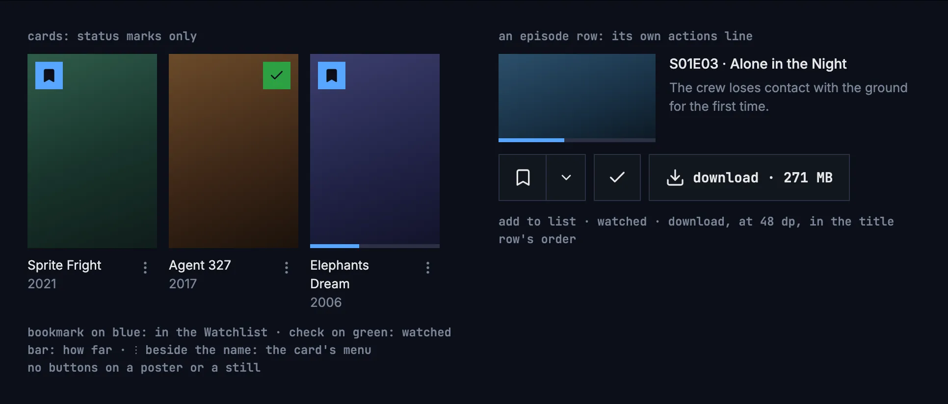
Figure 6.17: Cards with their status marks, and an episode row with its own actions line.
- Episode rows carry their actions in the row's own actions line, at the same 48 dp and in the title row's order: add to list, watched, download.
- Cards in a grid show only status marks, drawn as in the table of section 6.5.3: the Watchlist bookmark on blue, the watched check on green, and the progress bar. Actions live on the title's page, or in a card's menu where it has one.
- A card's menu has its button beside the name, under the poster, and on a TV opens when OK is held on the card. It offers play, or resume for a title the person is in, and mark as watched, or watched while the mark is on, which takes it off. On home's continue watching it also offers remove from continue watching (chapter 4).
6.6 Play on a show
Section titled “6.6 Play on a show”A show isn't played itself: its episodes are. So a show's first button plays an episode, and names it by its code, which keeps its capitals:
| The show | The first button |
|---|---|
| Nothing watched yet | play S01E01 |
| An episode partly watched | resume S01E03 and start over, which plays S01E03 from its beginning |
| The last episode watched was finished | play S01E02, the next one |
| Every episode finished | play S01E01 |
Figure 6.18 shows the row in the first three cases.
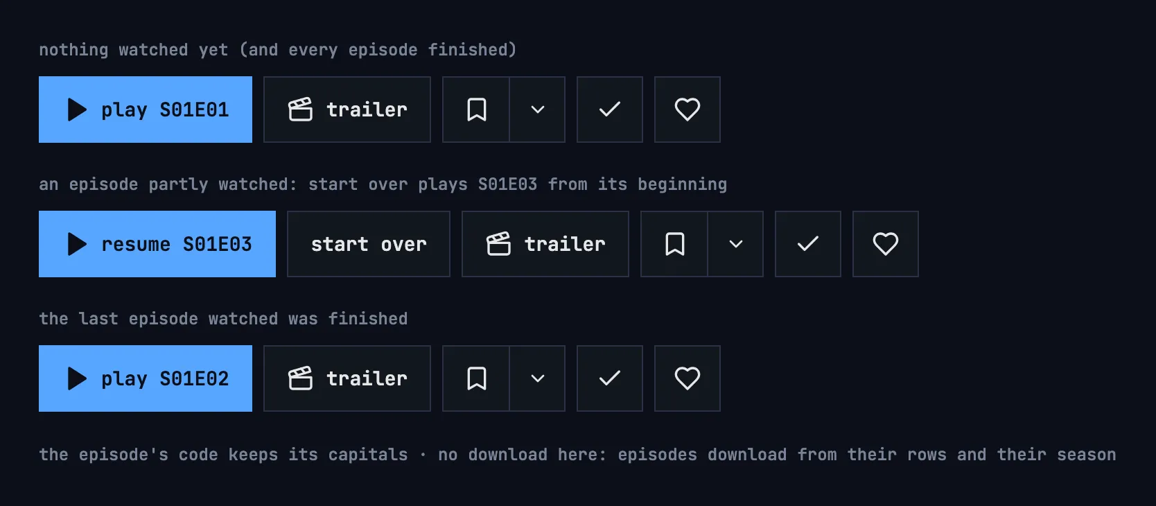
Figure 6.18: The row on a show: nothing watched yet; an episode partly watched; the last episode watched finished.
- The episode's position shows in its row below (figure 6.11), not in the button. The rest of the row is the same as on a movie, without download.
- S01E01 is the first episode of the first numbered season; the specials count only when a show has nothing else.
- A file that holds several episodes is named for all of them: play S03E18–19 (section 6.7.3).
- A page opened on one of its episodes (section 6.7.4) names that episode until the person plays on: resume S01E03 where it was stopped part way, else play S01E05. After that, the table above applies again.
6.7 Seasons and episodes
Section titled “6.7 Seasons and episodes”6.7.1 The seasons
Section titled “6.7.1 The seasons”- The numbered seasons come first, in order. Season 0 comes last, under specials: the specials, and any episode the catalog has no season number for.
- The first numbered season starts open, or the specials when they are all there is; a page opened on an episode opens that episode's season instead (section 6.7.4). The others start closed, and each stays open or closed while the person is on the page, also back from the player.
- A season's header gives its name and how many episodes it holds: season 1 and “6 episodes”, or “1 episode”.
6.7.2 The episode row
Section titled “6.7.2 The episode row”- An episode row shows, in this order: the still, with a bar where the person stopped; the code and the name, “S01E03 · Alone in the Night”; the length, “41 min”; “24 min left” for an episode stopped part way; the description, in two lines at most; and the actions line.
- The time left is rounded up, so the last half minute is “1 min left”.
- A finished episode's name is dimmed, and its watched toggle is on.
- The row plays the episode, from where the person stopped, else from its beginning. The actions line is apart from it: none of its controls plays.
- The actions line has the title row's order: add to list · watched · download. It runs under the description on a computer and on a phone held sideways, under the still and the text on a phone held upright, and at the row's end on a TV.
6.7.3 A file that holds several episodes
Section titled “6.7.3 A file that holds several episodes”A file that holds several episodes is one thing to play, so it is one entry: a box around the episodes it holds, named for them, “S03E18–21”, and as long as the file. Under the name it says “4 episodes · one file” and lists each episode by its number and name. None of them plays on its own, because the file doesn't say where one ends. The bar, the watched mark, add to list and the download are the file's.
6.7.4 Opened on an episode
Section titled “6.7.4 Opened on an episode”An episode has no page of its own. Opening one, from a card in continue watching or next up, from a notification or from search, opens its show's page with that episode's season open and the page scrolled to its row. The row is marked as where the person came from: with a blue outline on a computer and a phone, and on a TV with a blue bar along its left edge, as the design system's TV focus marks it. On a TV the focus starts on that row.
6.8 What the page shows
Section titled “6.8 What the page shows”6.8.1 The facts
Section titled “6.8.1 The facts”The facts follow the name, in one line where it fits, in this order:
- the year: “2012”;
- the length: “12 min”, “1 h 32 min”; a show has none;
- the genres: “science fiction”, “drama”;
- the rating with a star, as the catalog has it, rounded to one decimal: “6.6”;
- the age rating, where the catalog has one, as a badge in the words of the board that gave it: “FSK 12”, “PG-13”, an age alone as “12+”;
- the kind, as a badge: “movie” or “show”.
A fact the catalog doesn't have is left out, with its dot.
6.8.2 The people
Section titled “6.8.2 The people”- starring lists the actors in the order the catalog bills them, each with the part they play. An actor credited for two parts is listed once, with both: “Old Thom / Narrator”.
- On a computer and a phone the first six actors show, and full cast (12) shows the rest; show less hides them again. A cast at most two longer than six shows whole: a button that hides two names saves nothing. A TV has the row of cards of figure 6.10 instead.
- The crew follows, a role at a time, each under its label: Created by, Director (Directors for several), Writer, Producer, Music, Cinematography, Editor, then any other role by its name.
- Subtitles names the languages the title has subtitles in, each once, in alphabetical order: “Chinese (Simplified), English, German”.
- A name opens the person's page (chapter 7) when the catalog has a page for them; a name without one is plain text. On a TV it still takes the focus, so a row can be walked from end to end.
6.8.3 More like this
Section titled “6.8.3 More like this”more like this holds up to 12 titles that share genres and people with this one, as the server ranks them, as posters with their status marks (section 6.5.4). A title with nothing like it has no such row.
6.8.4 Back from the player
Section titled “6.8.4 Back from the player”Back on the page from the player, the page doesn't load again. It keeps what it shows and quietly brings up to date what playing changed: the first button, the bars and the watched marks.
6.9 Changes
Section titled “6.9 Changes”Every difference between section 6.2 and the target is one change in the table. A change names the apps it is built in, what they do today and the target, with the figure or the section that sets it out; it is built as its row says, and nothing else changes with it. Each change starts as proposed; once the owner approves it, it is built, one change at a time. A target that starts with “Recommended” was an open decision, or takes away something an app has today. The frame itself, the top bar, the tabs and the rail, belongs to chapter 2, the downloads' own words to chapter 13, and the dialog that creates a list to chapter 8.
| No. | Change | Apps | Today | Target | Status |
|---|---|---|---|---|---|
| 6.C1 | The frame on the title page | Web, Phone app, Android TV, Samsung TV | Web: none; back and home float over the still, and on a phone held upright the poster covers them (figure 6.3). Phone app: a bar of its own with back and home, no tabs, and no bar while the page loads or when it couldn't load. Android TV, Samsung TV: no rail, nothing at the top | the frame of chapter 2 with no view current, in every state of the page: the top bar on a computer; on a phone the back arrow and the title's name in place of the bar, with the tabs, or the rail held sideways; on a TV the rail (figures 6.7 to 6.10). The page has no home button of its own | proposed |
| 6.C2 | Loading: grey blocks | Web, Phone app, Android TV, Samsung TV | Web, Phone app: a spinner alone. Android TV: “Loading…”. Samsung TV: a spinner and “Loading…” | nothing for 0.4 seconds, then grey blocks in the page's shape (figure 6.19) | proposed |
| 6.C3 | No words on the still | Web, Phone app, Samsung TV | Web: the name, the tagline, the facts and the genres stand on the still's dimmed foot (figure 6.1). Phone app: the same from 600 dp wide. Samsung TV: the top half of the page stands on it | the still fades into the page's colour before the first words; only the poster reaches up into it (figure 6.7, parts 1 and 2) | proposed |
| 6.C4 | Upright: the poster beside the name | Web, Phone app | below 768 px (Web) or 600 dp (Phone app) wide, the poster, 192 wide, stands above the name (figure 6.3) | below 600 dp wide, the poster 96 dp wide beside the name, the facts on up to three lines, the row in view without scrolling (figure 6.8) | proposed |
| 6.C5 | Sideways: the computer's layout at the phone's size | Web, Phone app | Web: from 768 px the computer's layout, the poster 256 px beside the name and the row beside it, wrapping (figure 6.4). Phone app: from 600 dp the poster, 192 dp, beside the name and the row | from 600 dp wide, figure 6.9: the still a band, the poster 96 dp beside the name, the facts on one line, the row on one line under them, the people three to a line; the episodes as in figure 6.13; turning the phone as section 6.3.4 says | proposed |
| 6.C6 | The facts line | Web, Phone app, Android TV, Samsung TV | the length “12m”, “1h 32m”, and a show has one; the genres as chips in the catalog's words, “Sci-Fi & Fantasy”. Phone app: the kind “MOVIE”, “SERIES”, the rating cut, no age rating. Android TV: the kind “movie”, “series”, the rating in the TV's language, “7,4”, no age rating. Samsung TV: “MOVIE”, “SERIES”, “EPISODE”, no age rating | section 6.8.1: one line, “2012 · 12 min · science fiction · ★ 6.6”, then the age rating's badge and the kind's, “movie” or “show”; “1 h 32 min”; a show without a length; the genres as words in the line; the rating rounded, with a point | proposed |
| 6.C7 | trailer with the clapperboard | Web, Android TV, Samsung TV | a trailer online shows a video site's logo | the clapperboard, whatever plays the trailer (section 6.5.1) | proposed |
| 6.C8 | Android TV: the row at 40 dp | Android TV | the row's controls 33 dp high, about 22 dp apart | 40 dp high, 12 dp apart, the add-to-list parts as section 6.5.2 has them (figure 6.10, part 2) | proposed |
| 6.C9 | Samsung TV: the title row | Samsung TV | the words capitalised: “Play”, “Resume 1:43”, “Start over”, “Trailer”; add to list a “+” turning into a check on green, using the default list, with no picker; no liked; watched an eye; a focused plain button white, the ring in the accent's blue | section 6.5: the words lowercase; add to list in two parts with the list picker; liked; watched a check, dark on green when on; the design system's TV focus, the ring in the focus colour | proposed |
| 6.C10 | The list picker's way to a new list | Web, Phone app, Android TV | Web: “new list…” opens a name field inside the picker. Phone app: “New list…”, a field and a check. Android TV: “New list…” is the first row, then a field | the last row, create list, opens the dialog of chapter 8, and the title goes into the new list at once (section 6.5.2) | proposed |
| 6.C11 | The description | Web, Samsung TV | without one, “No description available.”; Samsung TV: never cut | without one, nothing in its place; on a TV four lines at most, ending in “…” (sections 6.3.1, 6.3.5) | proposed |
| 6.C12 | starring, the crew and the subtitles | Web, Phone app, Android TV, Samsung TV | Web, Phone app: “Starring” a label, “Full cast (12)”, “Show less”; the subtitles in the tracks' order, and in the Phone app with their kind, “English · for deaf and hard of hearing”, cut after two lines. Android TV: the crew's and the subtitles' labels lowercase, “director”, “subtitles”. Samsung TV: the subtitles in the tracks' order, whole | section 6.8.2: starring a heading, full cast (12) and show less; the crew's labels as field labels, “Director”, “Subtitles”; the languages each once, alphabetical, without their kind; on a TV three lines and “+12 more” | proposed |
| 6.C13 | TV: the starring cards with photos | Android TV, Samsung TV | the cards show the initials, never a photo | the photo, or the initials where the catalog has none (figure 6.10, part 3) | proposed |
| 6.C14 | No Analyzed fact | Web, Phone app, Samsung TV | “Analyzed”: “Intro · Credits · Recap”, the parts the server found | Recommended: left out; the page says what the title is, and the player shows those parts on its seek bar (chapter 11) | proposed |
| 6.C15 | The headings and the season's words | Web, Phone app, Android TV, Samsung TV | Web: “Episodes”, “Season 1”, “1 episodes”, “More like this”. Phone app: “Episodes”, “Season 1”, “More like this”. Android TV: “Season 1”, “Season 0”, “1 episodes”. Samsung TV: “Episodes”, “Season 1”, “Specials”, “1 episodes”, “More like this” | episodes, season 1, specials, more like this, lowercase in the monospace face; “6 episodes”, “1 episode” (section 6.11) | proposed |
| 6.C16 | The seasons: specials last, the first numbered season open | Web, Phone app, Android TV | Web: season 0 hidden while the show has numbered seasons. Phone app: the server's order, season 0 first, every season closed. Android TV: season 0 first, and the first listed open | Recommended: section 6.7.1, the numbered seasons first, season 0 last and closed as specials, so nothing in the library is out of reach; the first numbered season open; the repeats season 0 holds fixed in the catalog | proposed |
| 6.C17 | More like this with the status marks | Phone app, Samsung TV | Phone app: the posters without their marks. Samsung TV: without the watched mark | posters with their status marks (section 6.8.3) | proposed |
| 6.C18 | The episode row's words and look | Web, Phone app, Android TV, Samsung TV | Web, Phone app: “35m” and “Resume · 30m left”. Android TV: the same, “75m” past an hour, and a watched episode's name not dimmed. Samsung TV: no bar and no time left, a watched name not dimmed | section 6.7.2: “41 min”, “1 h 12 min”, “24 min left” rounded up, the bar on the still, a finished episode's name dimmed | proposed |
| 6.C19 | The actions line in the title row's order | Web, Android TV | watched, then add to list; on the web on a phone the two stand one under the other beside the still (figure 6.6) | add to list · watched · download, under the description on a computer and held sideways, under the still and the text across the row held upright, at the row's end on a TV (section 6.7.2, figure 6.12) | proposed |
| 6.C20 | Samsung TV: the episode row's actions and files | Samsung TV | only the watched toggle, an eye; a file of several episodes is a row per episode | add to list and watched at the row's end (figure 6.14); a file of several episodes as one entry (section 6.7.3) | proposed |
| 6.C21 | Opened on an episode, the first button names it | Web, Phone app | the first button names the episode the show's page plays anyway, not the one it was opened on | that episode until the person plays on: resume S01E03 where it was stopped part way, else play S01E05 (section 6.6) | proposed |
| 6.C22 | Samsung TV: an episode opens its show's page | Samsung TV | an episode from continue watching or a notification opens a page of its own, without seasons | its show's page, that season open, the row marked with the blue bar and the focus on it (section 6.7.4) | proposed |
| 6.C23 | TV: where the focus starts and where it comes back | Android TV, Samsung TV | Android TV: the code sets no first focus. Samsung TV: back from another page or from the player loads the page again, the focus on play | the focus starts on play or resume; back puts it on the card or the name that opened a page, the page scrolled as it was; back from the player keeps the page (sections 6.3.5, 6.8.4) | proposed |
| 6.C24 | Couldn't load, removed and no access, by cause | Web, Android TV, Samsung TV | Web: a quiet back beside try again. Android TV: no access says “you don't have access to this title”. Samsung TV: one red line, “Could not load this title: chino-api 503.”, also for 404 and 403; no button | figures 6.20 to 6.22 and the table of section 6.10: try again alone, the reason by cause, details; “this title isn't in the library anymore” and “you don't have access to this”, each with back | proposed |
| 6.C25 | The episodes that couldn't load say so | Phone app, Android TV, Samsung TV | the episodes are left out without a word | “couldn't load the episodes”, the reason and try again in their place, the rest of the page as it is (section 6.10) | proposed |
6.10 States
Section titled “6.10 States”The title page is drawn in figures 6.7 to 6.14 with everything loaded. Figures 6.19 to 6.22 show the states in between.
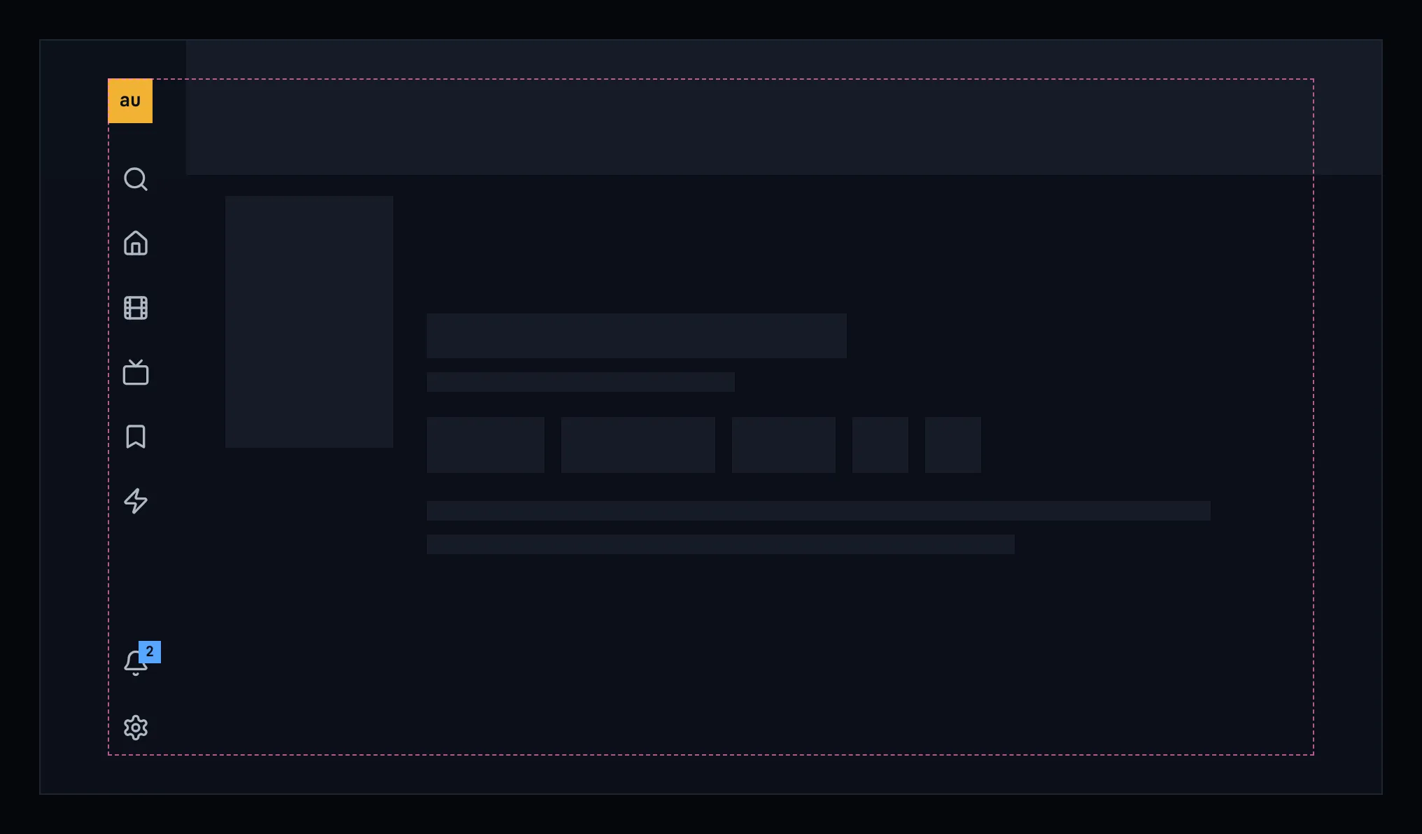
Figure 6.19: The title page loading, on a TV.
While the page loads, it shows nothing for the first 0.4 seconds, and after that grey blocks in the shape of the still, the poster, the name, the facts, the row and the description, as the design system's loading and progress describes. Figure 6.19 shows them on a TV; a computer and a phone show the same blocks in their own layout.
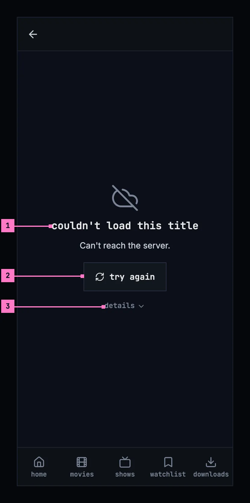
Figure 6.20: The title page when it couldn't load, on a phone.
- What couldn't load, and why. “couldn't load this title”, and under it the reason as far as the app can tell. Figure 6.20 shows the case where the server didn't answer; chapter 17 lists every cause and its sentence.
- try again loads the page again. It takes the focus first.
- details opens the server's answer, such as “HTTP 503 Service Unavailable”, for the people who fix things.
Held sideways, as figure 6.21 shows, the same words stand in the middle of the page, beside the rail and under the slimmer bar.
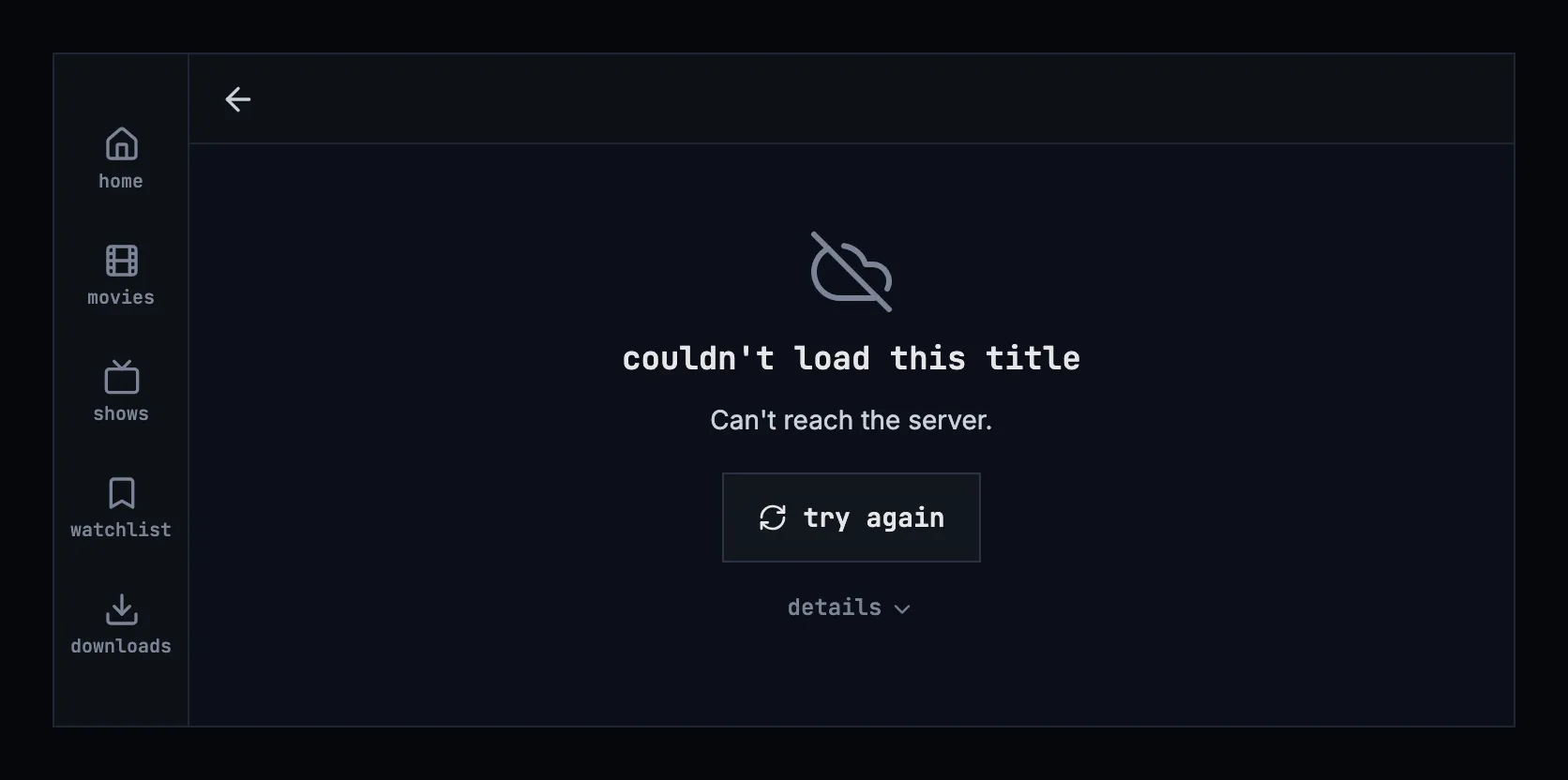
Figure 6.21: The title page when it couldn't load, on a phone held sideways.
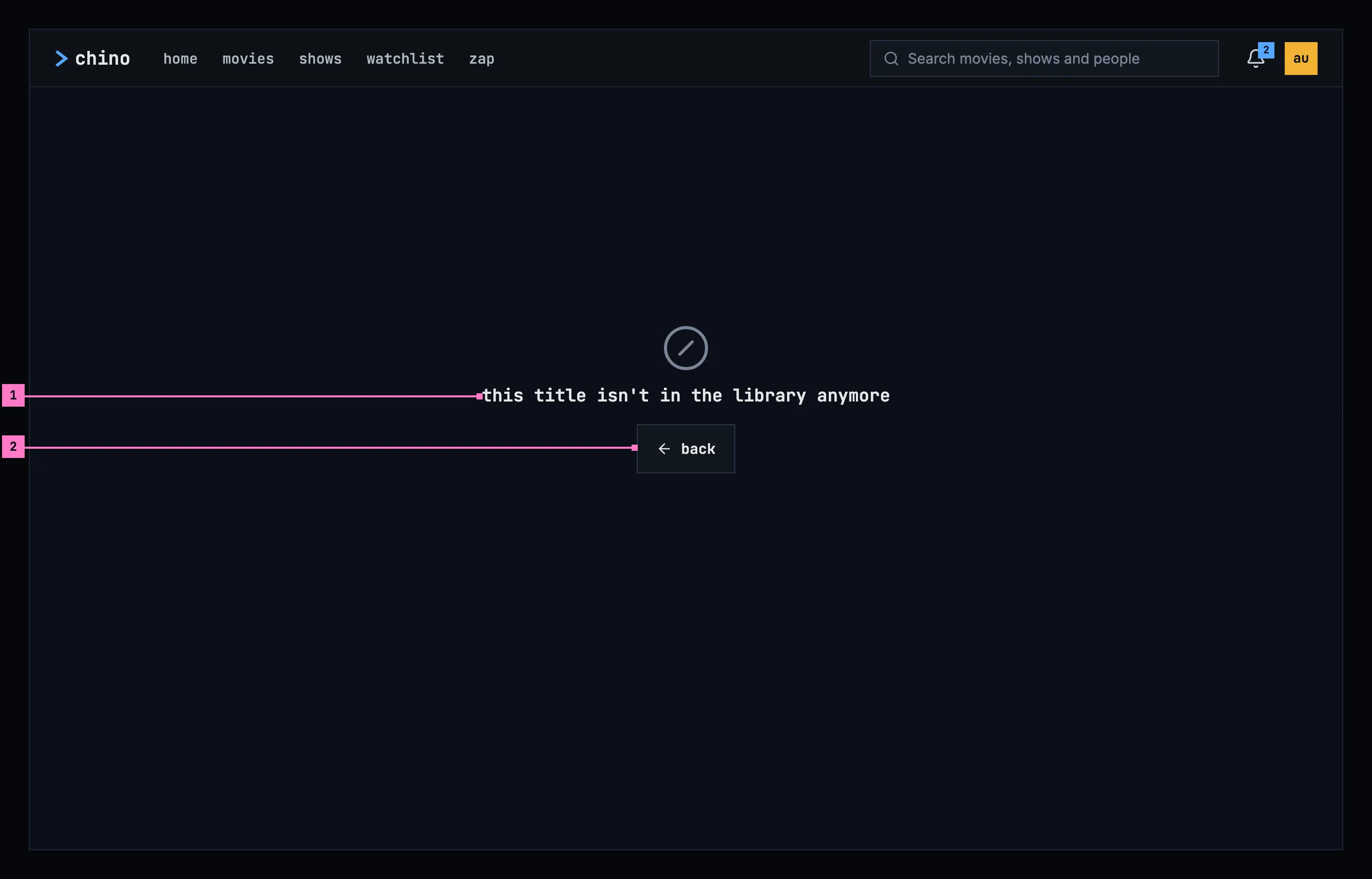
Figure 6.22: A title that isn't in the library anymore, on a computer.
- What is true: “this title isn't in the library anymore”. Trying again can't bring it back, so the page offers no try again and gives no reason.
- back returns to where the person came from, or to home when they came straight to the page, from a link.
| State | What the page shows |
|---|---|
| Loading | Figure 6.19 |
| Couldn't load | Figures 6.20 and 6.21, with the sentence for the cause |
| The title was removed | Figure 6.22 |
| The person may not see it | “you don't have access to this”, with back |
| The sign-in has expired | Nothing of its own: the app renews the sign-in and loads the page; only a refused sign-in leads to signing in, and back to the page |
| A show's episodes couldn't load | The rest of the page; in the episodes' place, “couldn't load the episodes”, the reason and try again |
| No description, no people, nothing like it | Each part is left out, and nothing says it's missing |
| The phone app can't reach the server | A downloaded title's page is built from what is on the phone, with the banner on top (chapter 13); any other title's page is figure 6.20 |
6.11 Words
Section titled “6.11 Words”| Where | Text |
|---|---|
| The title row | play · resume 1:43 · start over · trailer · download · 152 MB |
| A show's first button | play S01E01 · resume S01E03 · start over · play S03E18–19 |
| The row's icon buttons, for screen readers | add to Watchlist · in your Watchlist · choose lists · mark as watched · watched · like · liked |
| The list picker | add to list · create list |
| A card's menu | play · resume · mark as watched · watched · remove from continue watching |
| The facts | 2012 · 12 min · 1 h 32 min · science fiction · 6.6 · FSK 12 · 12+ · movie · show |
| The people | starring · full cast (12) · show less · Created by · Director · Directors · Writer · Writers · Producer · Producers · Music · Cinematography · Editor · Editors · Subtitles |
| Subtitle languages on a TV, when they don't fit | “Arabic, Chinese, English, +12 more” |
| The episodes | episodes · season 1 · specials · 6 episodes · 1 episode |
| An episode row | S01E03 · Alone in the Night · 41 min · 24 min left |
| A file of several episodes | S03E18–21 · 4 episodes · one file |
| Similar titles | more like this |
| The phone's downloads | download · 152 MB · download 3 more episodes · 940 MB · 1 of 6 downloaded, and the statuses of chapter 13 |
| Couldn't load | couldn't load this title · Can't reach the server. · try again · details |
| The episodes couldn't load | couldn't load the episodes |
| Removed | this title isn't in the library anymore · back |
| No access | you don't have access to this · back |